





Best Fall Color Palettes for Photos | Lauren Bounds Photography
Fall is one of the most beautiful times of year for family photos. The changing leaves, warm light, and rich textures create a beautiful outdoor backdrop for photographs you’ll enjoy displaying in your home.
However, choosing what everyone should wear can feel overwhelming. You want your family to coordinate without looking too matchy, complement the fall scenery, and still feel like yourselves.
The good news is that creating beautiful outfits starts with choosing the right color palette.
Here are some of my favorite fall color palettes for outdoor family photos and tips for putting them together.
Start With a Color Palette, Not Matching Outfits
One of the easiest ways to create cohesive family photos is to choose a palette of three to five complementary colors.
Instead of dressing everyone in the same color, choose shades that work well together. This creates more depth and visual interest in your photographs.
For example, instead of everyone wearing beige, you might combine:
- Cream
- Camel
- Rust
- Soft brown
- Muted olive
The result feels coordinated while allowing each person to wear something different.
When planning your family photo outfits, I recommend starting with one outfit you love. This could be Mom’s dress, a favorite sweater or outfit. From there, you can build the rest of the family’s wardrobe around those colors.
Warm Neutrals and Earthy Tones
Warm neutrals are always a beautiful choice for fall family photos.
Think cream, camel, tan, warm brown, and soft beige. These colors pair beautifully with Colorado’s fall landscape and allow your family to stand out without competing with the scenery.
Try combining:
- Cream
- Camel
- Chocolate brown
- Warm beige
- Muted rust
This palette works especially well if you plan to display your photographs as framed artwork in your home. Neutral colors tend to complement a variety of interior styles and can make your photographs feel cohesive with your space.
Rust, Cream, and Olive
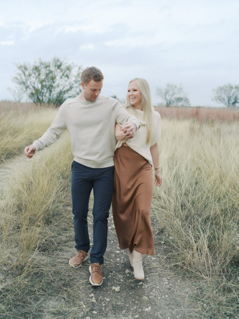
If you love traditional fall colors but want something more refined, rust, cream, and olive make a beautiful combination.
Rust brings warmth to your photographs without being overly bright. Olive adds depth, while cream keeps the palette light.
Consider adding:
- Rust or burnt orange
- Cream
- Olive green
- Camel
- Brown
The key is choosing muted shades rather than bright, saturated colors.
A rust dress paired with cream sweaters and olive or brown accents can create a beautiful, layered look for the whole family.
Soft Blues and Warm Browns
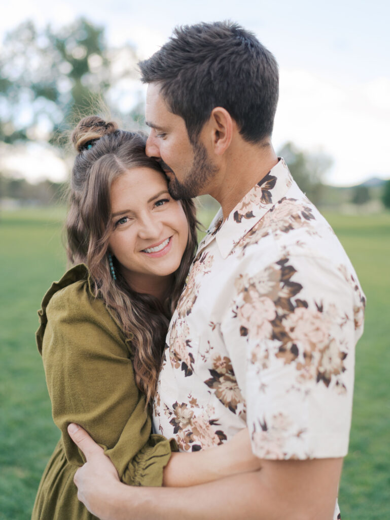
Blue may not be the first color that comes to mind when planning fall family photos, but softer shades of blue can look beautiful against warm autumn colors.
Try combining:
- Dusty blue
- Warm brown
- Cream
- Camel
- Soft gray
This palette creates contrast without feeling too bold.
Blue also works particularly well for Colorado fall sessions, where golden grasses and changing leaves often create warm backgrounds.
Burgundy, Blush, and Cream
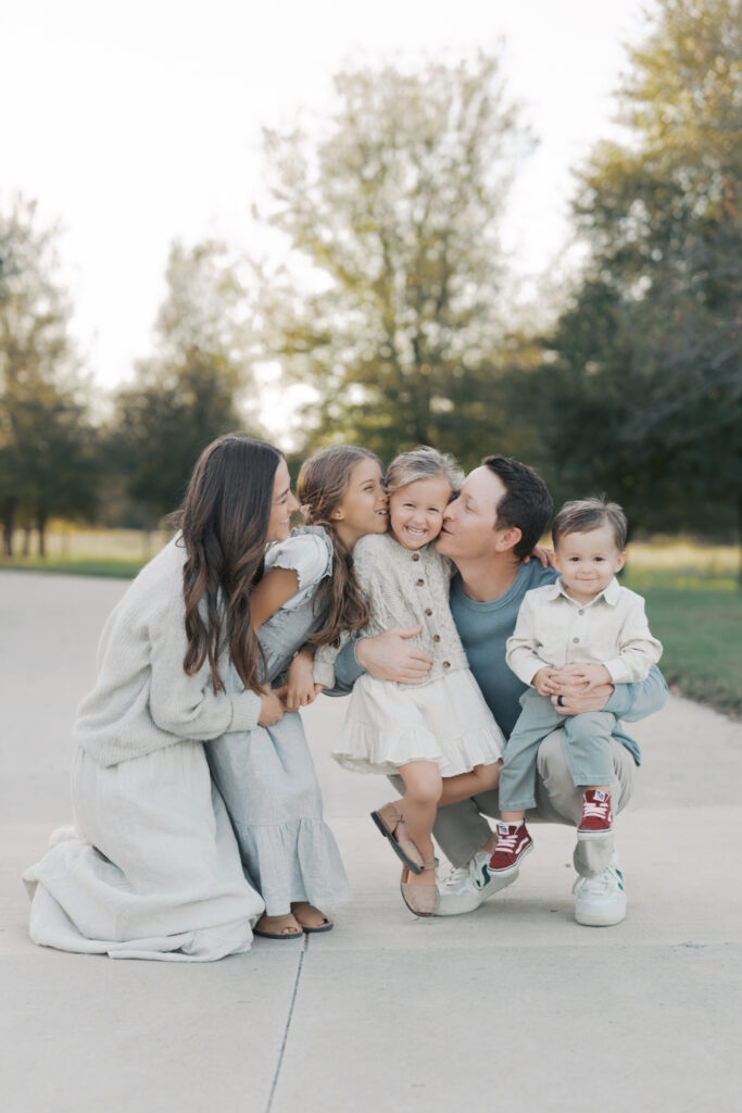
For families who want a richer and slightly more romantic look, burgundy paired with softer neutrals can be a beautiful option.
Consider:
- Burgundy
- Dusty rose or muted blush
- Cream
- Warm brown
- Taupe
Burgundy adds depth and richness, while blush and cream keep the overall palette from feeling too dark.
When using deeper colors, I recommend balancing them with lighter tones. For example, one family member might wear burgundy while others wear cream, beige, or soft blush.
Mustard, Rust, and Deep Green
For a more colorful fall palette, try combining warm golden tones with rich greens.
This palette might include:
- Mustard
- Rust
- Deep green
- Cream
- Brown
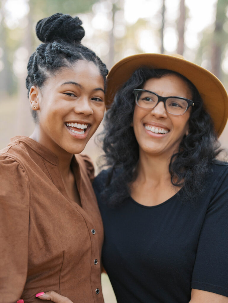
These colors work beautifully with fall foliage and can add warmth and personality to your photographs.
Again, the key is moderation. You don’t need every color represented in every outfit. Let the colors appear naturally throughout the family’s wardrobe.
Cream, Brown, and Black
A more modern fall palette can be as simple as cream, brown, and black.
This combination creates a sophisticated look and works particularly well if your personal style leans more classic or minimal.
Try mixing:
- Cream
- Ivory
- Camel
- Chocolate brown
- Black
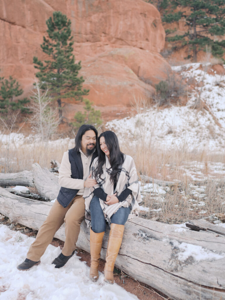
Adding texture can make this palette even more interesting. Think knit sweaters, linen dresses, suede boots, or corduroy.
How to Choose Colors That Work Together
When planning your family’s outfits, think about the overall balance of the group.
You don’t want everyone wearing dark colors, but you also don’t want everyone in light neutrals. Mixing lighter and deeper tones creates balance and dimension.
A good starting point might look like this:
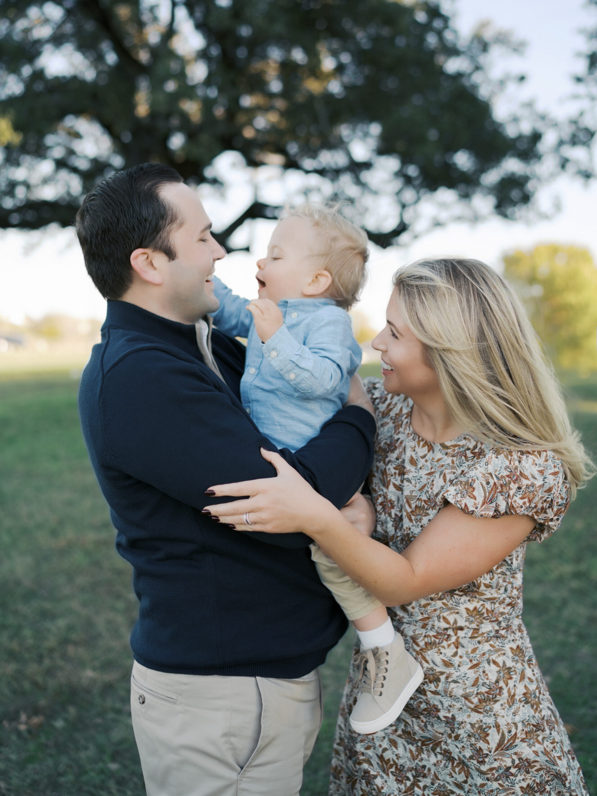
Mom: A patterned dress with cream, rust, and muted green.
Dad: A solid cream or camel sweater.
Child: A rust or olive outfit.
Another child: A neutral shade pulled from Mom’s dress.
Using one patterned piece can help bring the entire palette together. From there, choose solid colors that complement the pattern.
Don’t Forget About Texture
Color is important, but texture can make just as much of a difference.
Fall is the perfect time to incorporate:
- Knit sweaters
- Corduroy
- Suede
- Linen
- Cotton dresses
- Layers and cardigans
Texture adds dimension to your photographs without introducing additional colors or patterns.
This is especially helpful when working with a neutral palette. Different fabrics can keep the outfits from feeling flat.
What Colors Should You Avoid for Fall Family Photos?
There aren’t necessarily colors you can’t wear, but there are a few things to consider.
Very bright neon colors can distract from your family and compete with the fall landscape. Large logos and busy graphics can also draw attention away from faces.
I also recommend avoiding having everyone wear the exact same color.
Instead of everyone wearing the same shirts and jeans, choose a collection of colors that work together.
Your photographs will feel more natural and visually interesting when everyone has their own look while still fitting within the overall palette.
Consider Where You’ll Display Your Photos
One thing many families don’t think about when choosing outfits is where they plan to display their photographs.
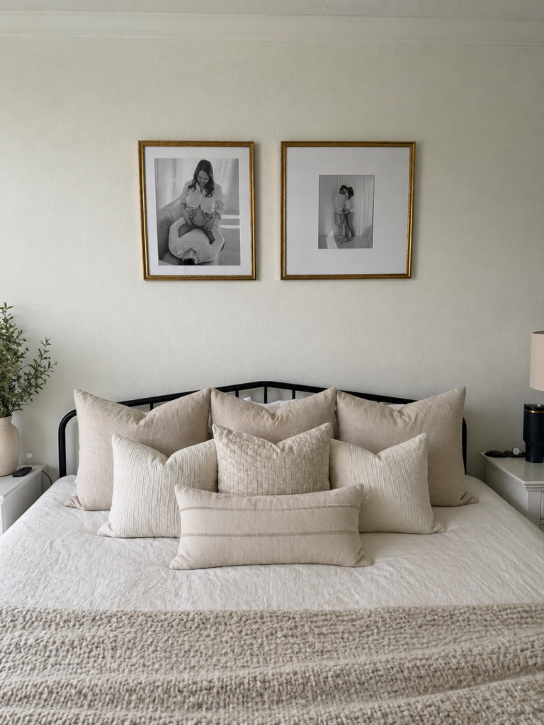
If you’re planning to create framed artwork for your home, consider the colors already present in your space.
A neutral palette may work beautifully in a home with warm woods and soft furnishings. A richer palette with burgundy or olive might complement a home with deeper tones.
Choosing colors with your final artwork in mind can help create photographs that feel beautiful both during your session and years later on your walls.
Need Help Choosing What to Wear?
Choosing outfits for family photos doesn’t have to mean spending hours trying to coordinate everyone’s wardrobe.
Once you have a color palette, everything becomes easier.
Start with one outfit you love. Choose three to five complementary colors. Mix lighter and deeper shades, add texture, and avoid making everyone match exactly.
Most importantly, choose clothing that feels like you.
When you book a family session with Lauren Bounds Photography, you’ll receive guidance throughout the planning process, including help with choosing outfits and creating a cohesive look for your photographs.
Looking for fall family photos in Colorado Springs or the surrounding area? I’d love to help you plan a session that feels beautiful, personal, and easy from start to finish.
Best Fall Color Palettes for Photos | Lauren Bounds Photography
I’m Lauren. I’m a photographer in Colorado Springs, CO where I live with my husband, two amazing kids, and goldendoodle. I love photographing families in a fun and stress free way that allows me to capture your unique personality and show genuine connections.
I believe family photos should be a fun way to preserve your most favorite memories. My aim is to provide you with a seamless experience. A relaxed session where you and your family can interact with each other and have fun. I want to give you images that portray your day-to-to life with your family so that we can freeze a moment in time forever.
Starting from inquiry to hanging your framed photos on the wall, I’m here to help and guide you. To stay up to date with current offerings, join my email list here and view my instagram here.


